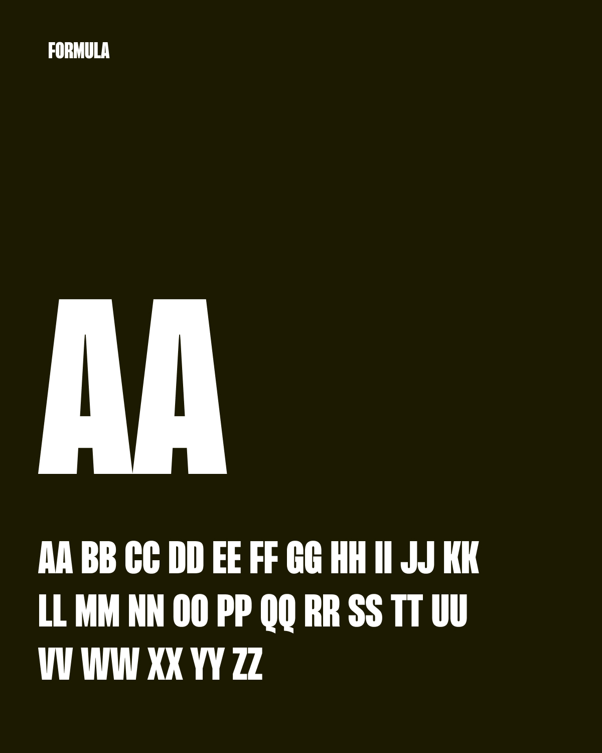
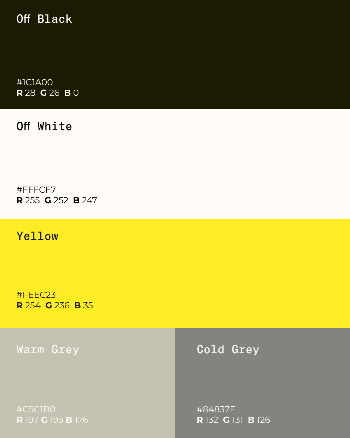
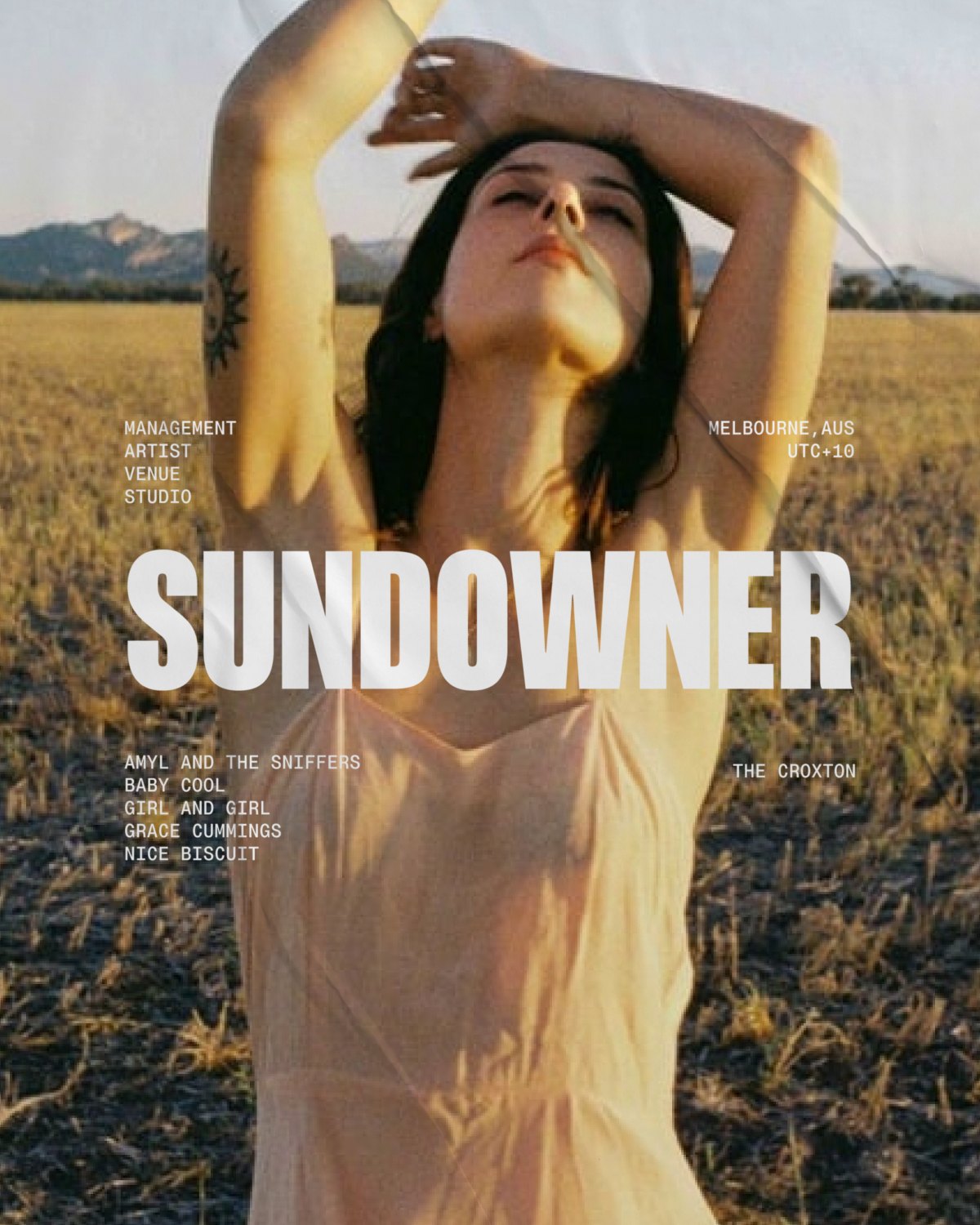
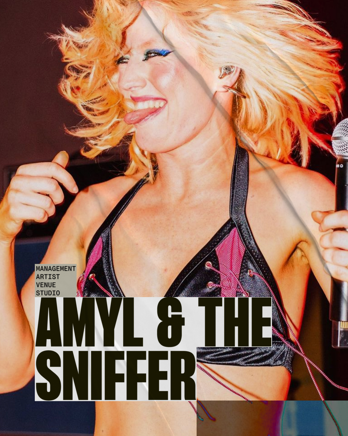
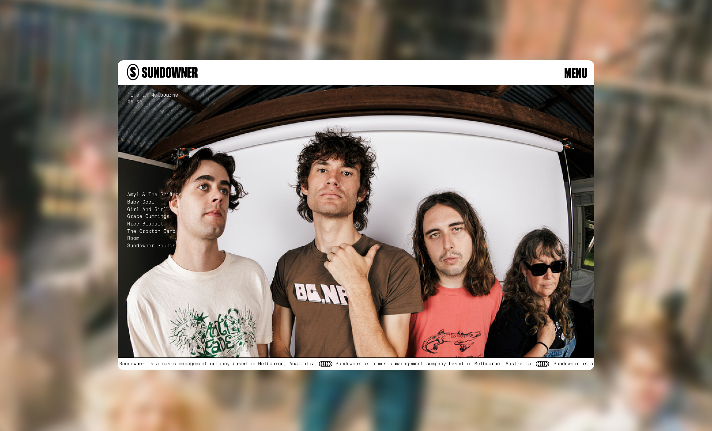
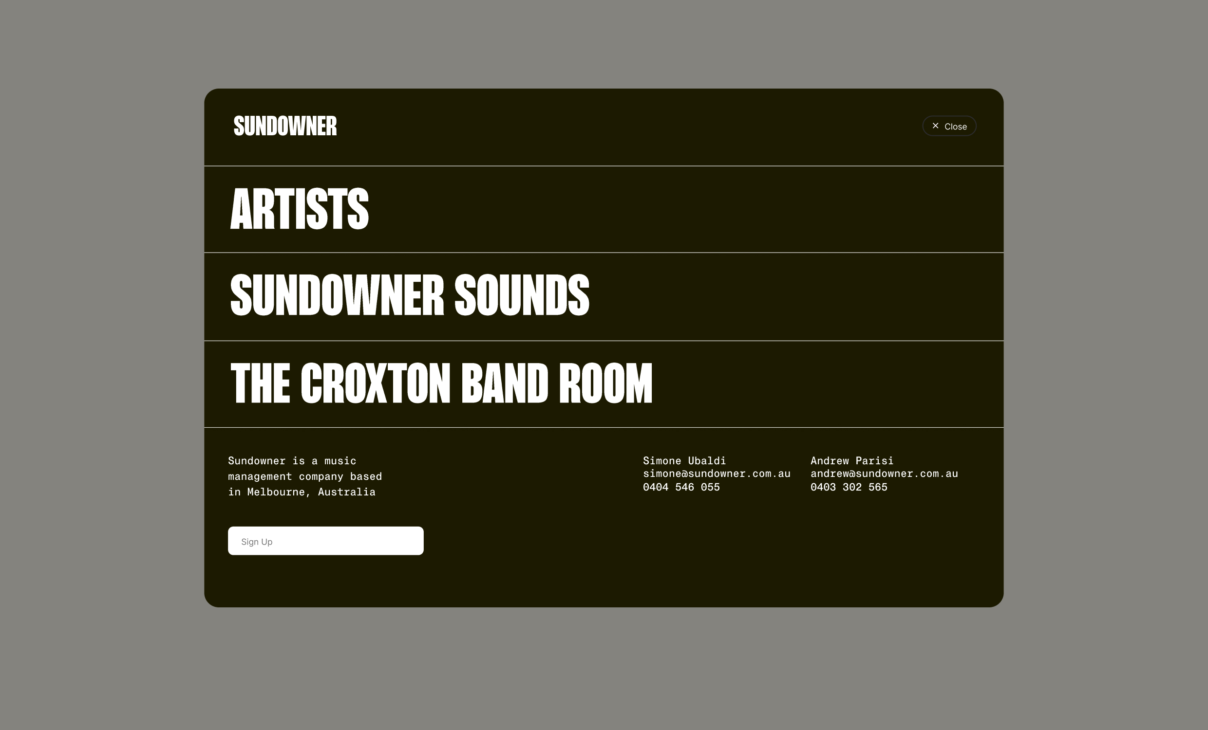
I developed a complete rebrand, including a new logo and visual identity system. The creative direction leaned into bold, confident typography and visual references drawn from the music industry itself: gig posters, vinyl sleeves, and the rough-edged aesthetics of touring culture. The colour palette, olive, black, and electric yellow, feels distinctive without being alienating, striking a balance between credibility and energy.
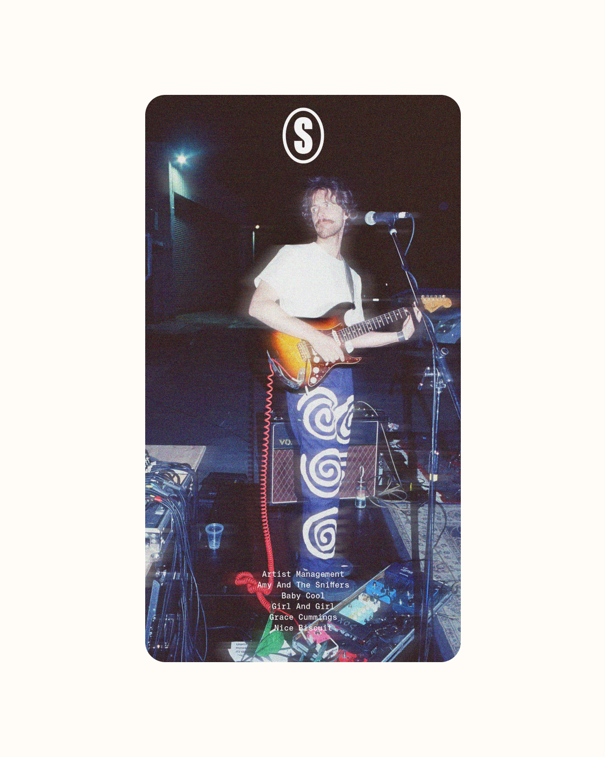
The brand system extended across a new website, marketing materials, and artist-specific assets, ensuring Sundowner's identity felt cohesive whether seen on a desktop, a social post, or a printed artist card. The typography does a lot of the heavy lifting, the condensed sans-serif used in the logo and repeated as a graphic device creates a strong, recognisable visual anchor that scales across every application.